Analytics Blog

10 Reasons to Adopt Adobe Analytics Analysis Workspace
Every New Year’s season is a delight for me because it’s an opportunity to make data-driven decisions in my life. I can look at an entire year’s worth of data, identify things I’ve been doing that may not be worth my time, and replace them with something better. As we say here so often at Blast,
“Do more of what works and less of what doesn’t.”
That’s why my number one New Year’s resolution is to not spend a single second longer than absolutely necessary in Adobe Analytics “Reports and Analytics.” That’s it. I’m done.
Instead, from this moment on I will be using Adobe Analytics Analysis Workspace exclusively. This may sound dramatic, but if you hear me out, I bet you’ll agree that this is one New Year’s resolution worth keeping.
How to Simplify Reporting in Adobe Analytics
To prove my point, here are 10 simple things you can do in Analysis Workspace (AW) that are either impossible to do in Reports and Analytics (R&A), or at least annoyingly difficult.
#1: Using More than 5 Metrics in One Trended Report
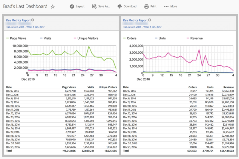
This has happened to me many times: I need to pull a high-level report on the main KPIs of the site. Only there’s one problem: the client has 6 KPIs they want to see but the “Key Metrics” report only allows you to see 5 at a time.
So now you are in a predicament. Do you publish 2 reportlets on your dashboard? One with 1 metric and the other with 5? But then it looks like you are disproportionately emphasizing that 1 metric. So maybe you split them up based on the type of metric: 3 traffic metrics on one graph with 3 conversion metrics on another. That’s fine, but then you don’t get to see them trended next to each other.
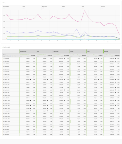
With Analysis Workspace, you no longer have to make this decision.
Now this:
Becomes this:
#2: Creating Segments Without Leaving the Page
I’ve been working with Adobe Analytics for several years now, so creating segments has basically become as common as breathing for me. It is one of the most important building blocks in analysis. This means any spare seconds I can save while in the flow of things will always be appreciated.
Let’s say you’re looking at a newly created dashboard and need to see the 6 KPIs graph segmented by all those who landed on a specific landing page. In Reports & Analytics, you would need to follow these steps:
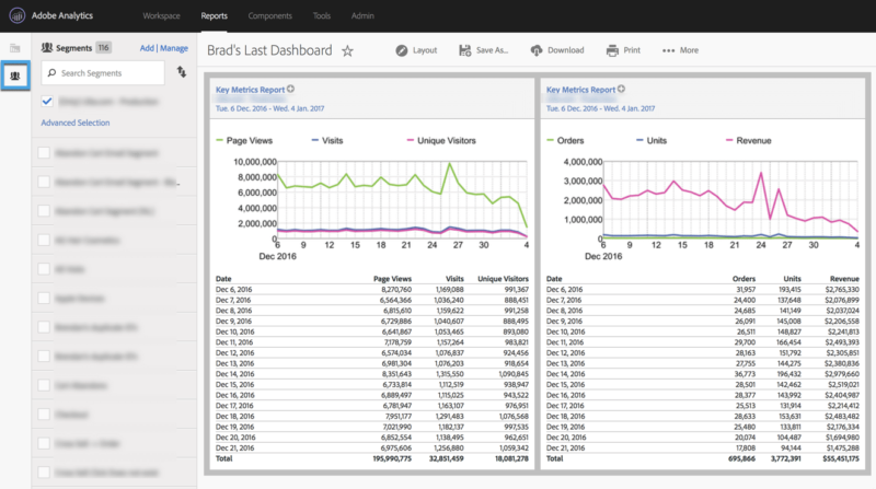
- Click on the segment icon on the left
- Assuming you haven’t made this segment before, click “Add”
- Name the segment
- Search for “Entry Page”
- Enter name of the specific landing page
- Hit Save (Now this segment has been applied to the entire dashboard, which is not what you want. Since you only want the KPI report to be segmented, you need to remove the segment.)
- Click on report suite in the reportlet
- Click on “All Visits (No Segment)”
- Find the Segment you just created
- Click “Apply” and then “Update”
- Update the second key metrics reportlet with the same segment
In Analysis Workspace, this is much easier:
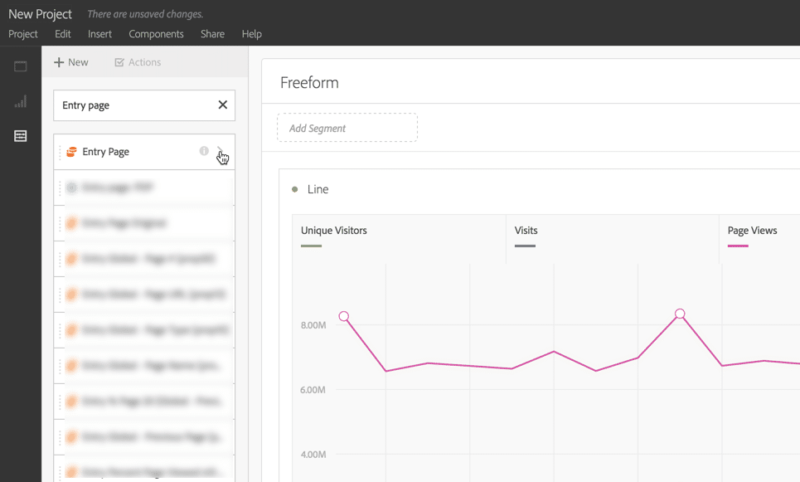
1. Search for entry page in Components:
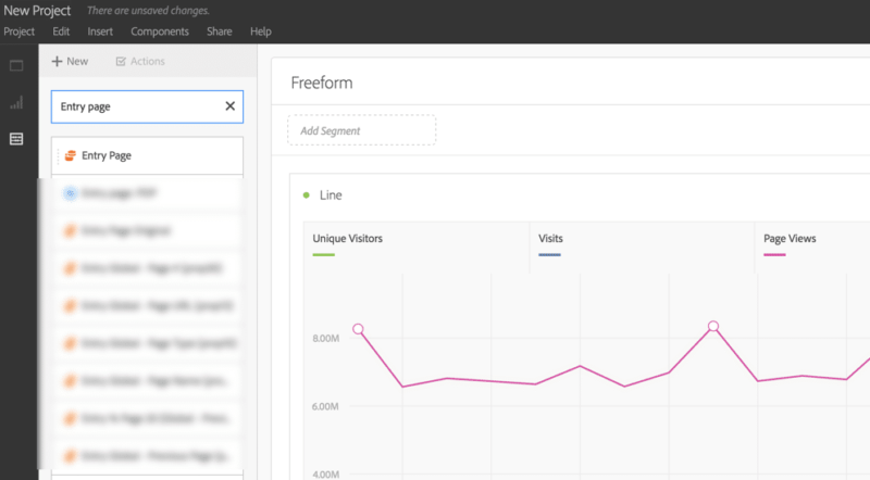
2. Click the arrow to expand the different entry page values:
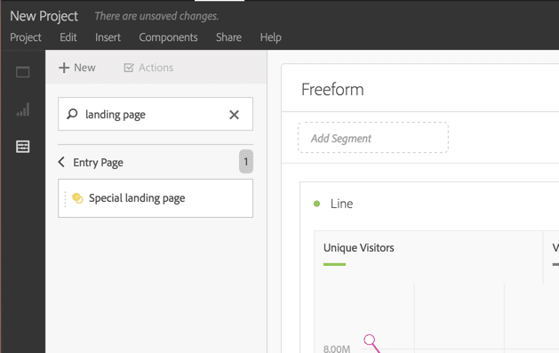
3. Search for the specific landing page in question:
4. Click Unique Visitors + Shift + Click Revenue to select all metric headings:

5. Drag “Special Landing Page” on top of the metrics:
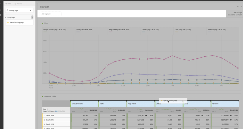
The report will now be segmented by all visits that had an entry page of the landing page you specified. (Note, you could have dragged it to the “Add Segment Area” but in this case we only wanted this report segmented, rather than the entire dashboard).
The best part about this process is that you never had to leave the page you were on. Everything took place within the actual report. Fewer pages means less waiting for them to load, which means more time for analysis.
#3: Using Individual Dimension Values as Column Headers (or Rows)
In Adobe Analytics Reports & Analytics, you have pretty limited display options in a report. Dimensions on the left, metrics on the right. Up to 10 metrics in a ranked report, 1 metric in a trended report, etc. You know the rules. Anyone who knows me knows I have a knack for breaking rules. Maybe that’s why I like Analysis Workspace so much.
Let’s go back to our 6-metric KPI chart and say the recipient of this dashboard would actually like to split up visits into New and Returning Visits. Let’s say I have a “New/Return Visit” dimension that I can use here. Since there are only two values in this dimension I can simply grab the entire dimension and drag it underneath visits:
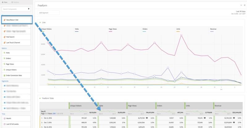
This will split up the visits number you see by new and return visits, both in the table and on the chart:
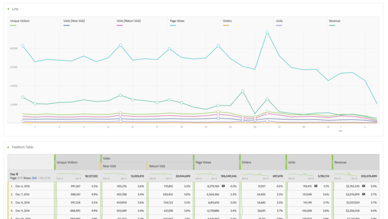
This technically would be possible in Reports & Analytics by using calculated metrics, but the beauty of Analysis Workspace is that, once again, you did not have to leave the page you were working on. Using calculated metrics, you would need to make two segments and two calculated metrics. And even then, depending on what calculated metric you made, you would still run into another problem…
#4: The N/A Problem with Adobe Analytics Calculated Metrics
I will be the first to say that I’m a huge fan of Adobe’s calculated metrics (so much that I even wrote a blog post about it recently). When compared to other analytics tools, well…there really isn’t anything that compares. However, ever since they upgraded their calculated metric builder, I’ve noticed that very often you do not get a “total” number. Instead you will get an “n/a” value:
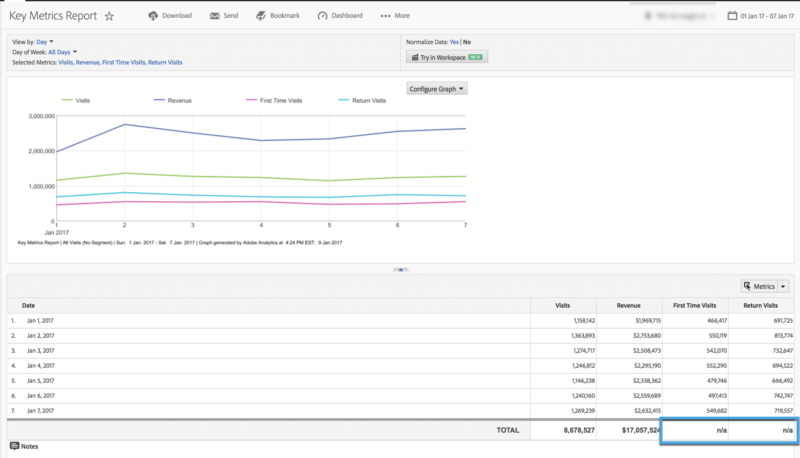
This can get very frustrating. This issue occurs just about every time you have a calculated metric that involves a segment of some kind.
When your average user sees that in a report, they instantly think something is wrong with the data and the seed of distrust begins to spread.
With Analysis Workspace, you do not have this issue:
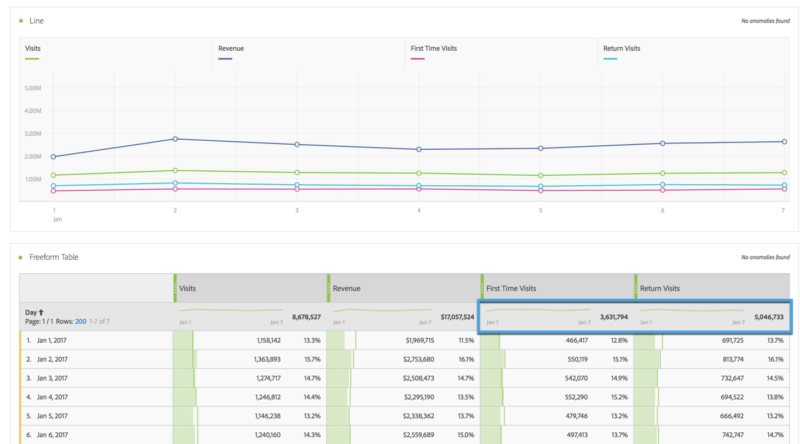
#5: Comparing More than One Segment in a Report
I find myself needing to compare multiple segments on a consistent basis. There was a recent situation where I wanted to take an extremely large list of campaigns and compare them by groups of about 10 or more based on a few characteristics or qualifiers.
Some example qualifiers included:
- Between 10% – 15% off
- BOGO offers
- Dollar-off amounts instead of percentages
- No discounts, but included other perks or giveaways
- Location specific, etc.
The team wanted to look at some simple metrics for these campaign types (e.g. bounce rate, conversion rate, average order value, etc.). One option would be to set up a classification rule builder to put these campaigns into these groups, but we couldn’t wait 24 hours for the classifications to fully process. This can be done in Reports & Analytics, but not in a single report.
In Analysis Workspace, it’s as simple as any other report. Once you create the segments the way you need them, you can drag them into a freeform table as if they were dimensions:

This allows you to view your data in an entirely new way that wasn’t possible before without first taking the data out of Adobe Analytics.
#6: Unlimited Subrelations
As I’m sure you know, in Reports & Analytics you can break props down by one another as long as you have patience for the report to continue to load. However, with eVars you are allotted a single breakdown. Meaning if you’ve ever found yourself itching to do your best DiCaprio and “go deeper”, you’re out of luck.
Until now! It might require a very specific situation to go more than 2 levels deep with eVars, but Analysis Workspace gives you the freedom to do so. It opens doors to answers that were previously much harder to find.
#7: Break Props and eVars Down by One Another (GASP!)
Since the dawn of Omniture in 1996, Props and eVars have been like oil and water, cats and dogs, Seahawks fans and 49ers fans: they don’t mix well.
In Reports & Analytics, you aren’t even given the option of breaking a Prop down by an eVar or vice versa. Analysis Workspace doesn’t hold your hand so much.
If you want to cross the streams, go ahead! What’s important is that you know how to interpret what you’re seeing. This can come in handy when you have an eVar that is persisting, want to know what prop values have fired, and want to attribute them to the value contained in that eVar.
For example: I am at a content production company and capturing internal campaign values in an eVar that persists through the visit. At the same time, you are capturing the site sub-section in a prop. Someone asks if you can pull a report for all of the internal campaigns over the last month, and show which internal campaigns generated the most traffic in the articles sub-section vs the audio files sub-section vs the video sub-section of the site.
There are certainly ways you could get this information in R&A, but it is much easier in Analysis Workspace:
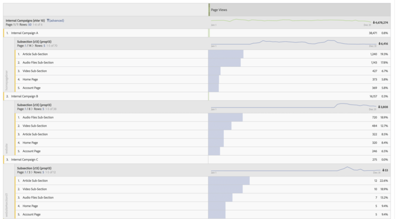
As with many reports in Adobe Analytics, and especially in Analysis Workspace, be sure to take a moment to digest what the report is really showing you so you don’t misinterpret the results.
#8: Fallout Reports are Better in Every Way
For a long time the only thing keeping me from cutting off Reports & Analytics completely was the pathing/fallout reports…until now! I previously tried to create fallout reports in Analysis Workspace by creating a series of sequential segments. There were a few benefits to this process:
- You can create cross-session funnels by making your segments visitor-scoped rather than visit-scoped.
- You can create fallout reports based on variables that aren’t necessarily just props with pathing enabled. For example, you can make a segment for those who started out on landing page x, watched video y, purchased product z. These can all exist in different variables (e.g. page name, video name eVar, product variable).
- You can create fallout reports that are longer than 7 steps (a limitation in R&A).
- You can then use those segments on other reports or view visits/visitors that make it to that step, trended over time.
These “segment fallout reports” allow for some interesting reporting but there was one problem: they were a huge pain to make. Making segments over and over and organizing them when you may have multiple fallout reports was always a hassle.
I’m convinced the Adobe AW product designers were watching over my shoulder as I labored with these segment fallout reports. As they have taken every one of the above points and made the fallout report in Analysis Workspace one of my favorite Adobe reports.
The new fallout report is better in every way.
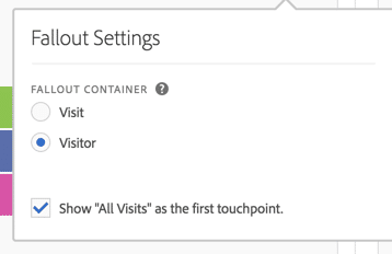
1. You can create cross-session funnels with the click of a button:
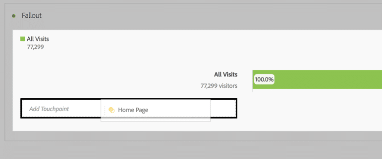
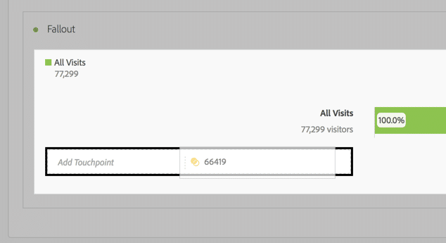
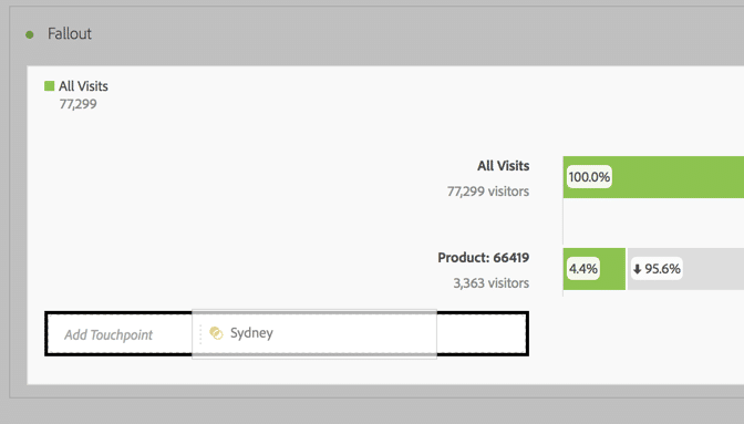
2. You can use variables other than props (even segments!).
Here’s how to use a page name:
Or a product ID:
Or an eVar value:
A segment:
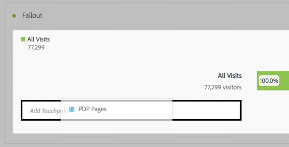
Or you can even combine multiple variables in one step:
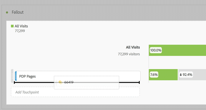
Becomes:
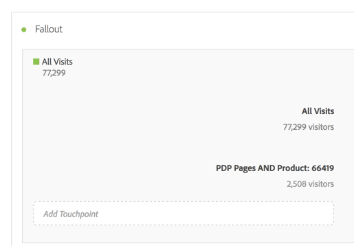
3. There’s no limit to the number of steps you can put in these new fallout reports.
4. With a single click, you can trend either those who fall out at a certain step or those who complete a step:
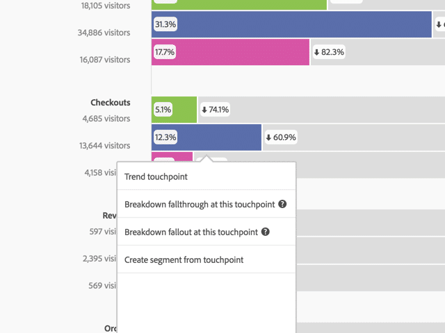
5. You can compare segments in one fallout report:
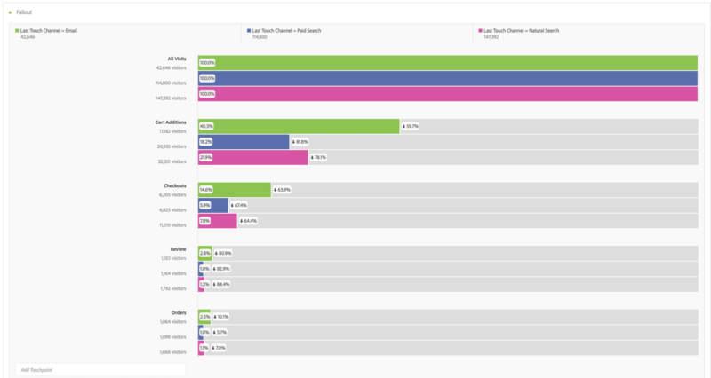
Needless to say, I haven’t used an Reports & Analytics fallout report since this capability was added to Analysis Workspace.
#9: Cohort Tables
There is so much that could be said about Cohort tables. Cohort analysis is the act of taking your set of data and grouping the users by a common characteristic and seeing how that group performs over time.
In the example below, we are looking at different cohorts by day. In the “Oct 1” cohort we are including all visitors that viewed an article on October 1st. We are then tracking that group of users to see how many of them returned in the subsequent days.
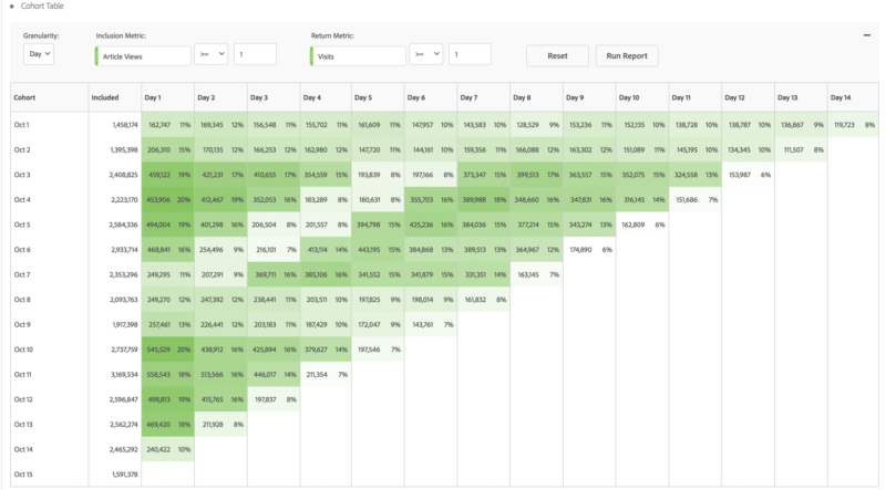
There are all kinds of different ways you can use these Cohort tables. For example, you can take a look at your cyber week shoppers and see how often they return to your site in the subsequent days. Or, you can dive into subscriber cohorts to optimize retention and acquisition efforts, like we did for Civil Beat.
One of the best parts of the Cohort tables happens when you right click on one of the boxes:
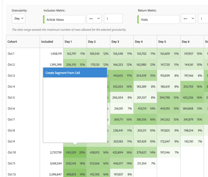
You can create a segment that matches that set of visitors in one click. From there you can use this segment in all of your other reports to answer deeper questions about this group of visitors.
One thing that is certain about Analysis Workspace Cohort Analysis — there is nothing like it in Reports & Analytics.
#10: Better Charts
In R&A, the charts that you get are, quite frankly, a little bit boring.
There is not a lot that you can do to change what you’re seeing on the screen. You can change it from a line chart to a bar chart or an area chart and that’s about it. In Analysis Workspace, you have some options that can be very helpful to give you some information at a glance.
For example, let’s look at a very simple trended report with visits and orders:
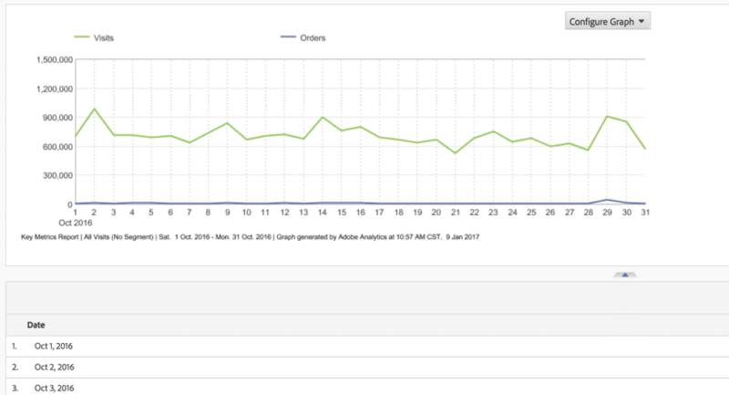
If you’re an analyst taking some time to dissect this report, you might notice something with orders on the 29th. But based on the scale, it’s hard to see much of anything. For visits it looks like they were a bit higher on the 29th and a bit low on the 21st, but it’s not immediately apparent with this view if those spikes and drops are significant.
In AW we have 2 features that will help magnify what is happening on that day. The first is dual axis, and the second is anomaly detection.
Once you have created this same chart, check the box that says “Show Anomalies” as well as the box that says “Dual Axis”. The difference is very obvious:

Right away I can see 3 things:
- That spike in orders on the 29th was a lot bigger than it looked before.
- The drop in visits is indeed more significant than previously expected.
- There was actually another small spike in orders on the 4th that was hardly noticeable on the R&A graph.
If you hover over each of the lines you get an idea how far outside the expected range these values were:


Thanks to Anomaly Detection, I’m aware of some things that I might want to further investigate.
One more thing I love about Adobe Analytics Analysis Workspace is that I can scroll down to October 29th and break that day down by the product dimension to see what the top products were on that day:
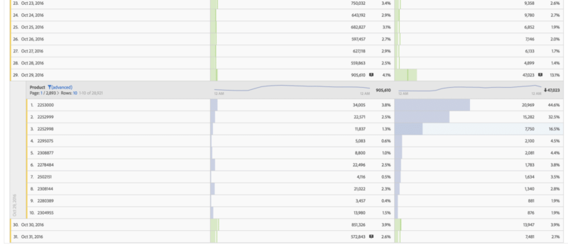
The beauty of that is I didn’t even have to load another report. These charts and tables work to answer questions as fast as my mind can come up with them.
Adobe Analytics is Even More Mature
With the most recent updates to Analysis Workspace, Adobe has made it clear that this is the future of their analytics platform. As the industry evolves, those working in it have continued to mature to a point where they are no longer asking just the “what” questions of their data, but also the “why” and “how” and “what next” questions.
Analysts want a space that matches the complexity of their questions with the flexibility to answer them.
I can confidently say, that space is finally here. And I’m confident I’ll stick to my New Year’s resolution, never looking back.
Will you join me? At the beginning of this in-depth post, I bet that you’d agree this is a New Year’s resolution worth keeping. Please leave a comment below on whether you agree or disagree. Are you planning on attending Adobe Summit in March? I’d love to meet up and discuss the ins and outs of Adobe. Tweet me @BradLMillett


