Analytics Blog

Uplevel Your A/B Testing Dashboards with Adobe Analysis Workspace
As a consultant, I’m used to working with various tools throughout the day. There are times when it makes sense to use different tools for different things. For example, you wouldn’t use Adobe Analytics or Google Analytics as a session replay tool. Or you wouldn’t use something like Optimizely to analyze multi-touch attribution models. But there are other times when using multiple tools raises unnecessary problems. For instance, each tool will measure sessions slightly differently than one another. Each tool will attribute goals and success to channels slightly different.
There are situations where the need to tag the same success event across multiple tools can be cumbersome, and then there’s the need to cross-train users on multiple tools to get answers to their analysis questions. Multiply those nuances across multiple toolsets and it can get frustrating quickly. With every extra tool you use to track the same thing, you get further from a single source of truth, which can cloud the overall transparency of your reporting efforts and impair your ability to understand true business impact.
With every extra tool you use to track the same thing, you get further from a single source of truth, which can cloud the overall transparency of your reporting efforts and impair your ability to understand true business impact Click & Tweet!
One such crossroads I’ve found many clients in is with A/B testing tools and traditional web analytics tools. Often the test has been run with this other traditional testing tool, and then there’s the need to do some deep-diving into the analytics to understand the results and why certain things may have happened. More often than not, the A/B testing tool isn’t set up to accommodate that level of analysis, so you turn to your analytics tool (in this case, Adobe Analytics). At this point, we start running into those issues I listed above. The analyst needs to be comfortable with both tools, they have to understand the nuances in how the data is captured, and they need to be comfortable explaining these nuances when the stakeholders notice things such as differences in conversion rate, user counts, or session counts.
Then there’s the need to deliver your analysis and test results. If you have the test results recorded in one tool and your secondary analysis in another tool, you then need to bring in a third tool, such as PowerPoint, to aggregate the findings and give recommendations.
If you’ve ever wanted a place where you could do all of these things in one place, you’re in luck. Adobe’s Analysis Workspace dashboard has all of your bases covered. Using Adobe’s advanced calculated metrics, you can build out beautiful visualizations that can easily visualize the uplift and statistical significance values over the lifetime of your test. With the markup and note-taking features, you can add your own commentary right alongside your charts, allowing for a simple printout for each test result. Finally, you have the ability to add any number of panels down below your test results charts to do deep-dive analysis, surfacing the most relevant parts to the results charts above. It’s your one-stop shop for reporting, analysis, and explanation. Below, I’ll walk you through how I would set up your workspace to do this:
Variable Configurations
As we all know, how you set up your variables is typically key to your success later on when it comes time to set up your A/B testing reports. For this particular situation, the setup is very simple — and, in fact, the majority of the heavy lifting is done through sequential segmentation and calculated metrics. This means the way you set things up could potentially be different, and you’d still be able to work it so that you get the same results. Here’s how I typically have my eVars set up for this type of analysis:
- 1 eVar for each test that captures the control and variant groups (visit expiration, last touch allocation)
- 1 event for whatever goal you are trying to measure (this could be any of your already existing success events such as your purchase event, cart addition event, or a form submission event)
And that’s it! You’re ready to go and able to create your dashboard in Adobe Analysis Workspace. Let’s look at the final product and work on creating each module in the order I usually create them:
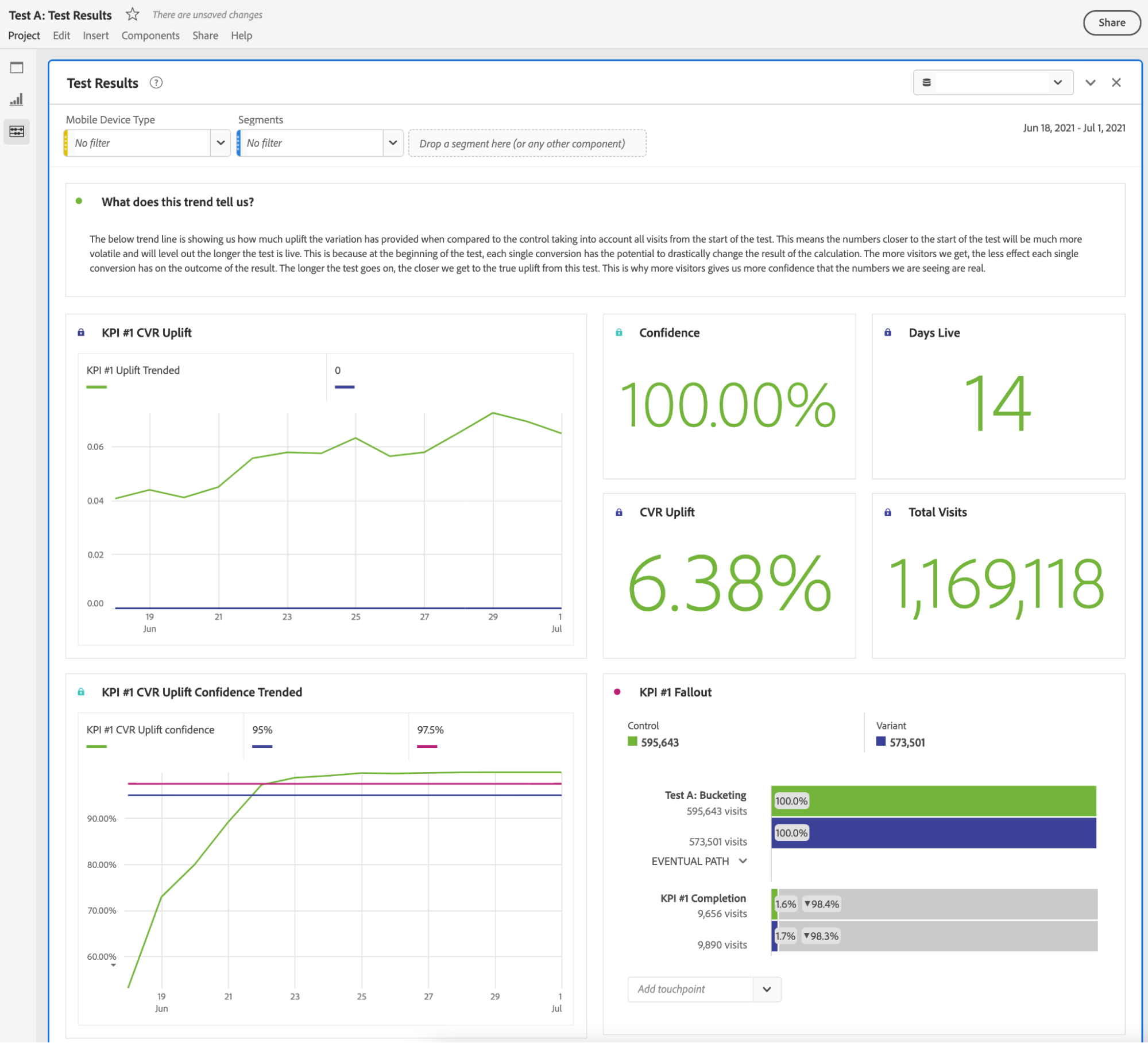
Calculated Metrics: Level 1 – Beginner
Start by setting the date range to a fixed start with the day your test was launched, ending today, and rolling daily.
The first visualization I make is always the fallout report:
For this one, it’s as simple as finding your test eVar, clicking the “>” to open up the list of values, and dragging both values as the first step, then your key performance indicator (KPI) as the second step.
The next step is to take each of the two values from your eVar and drag each to the top of the funnel to split the funnel by the “Control” and the “Variant.”
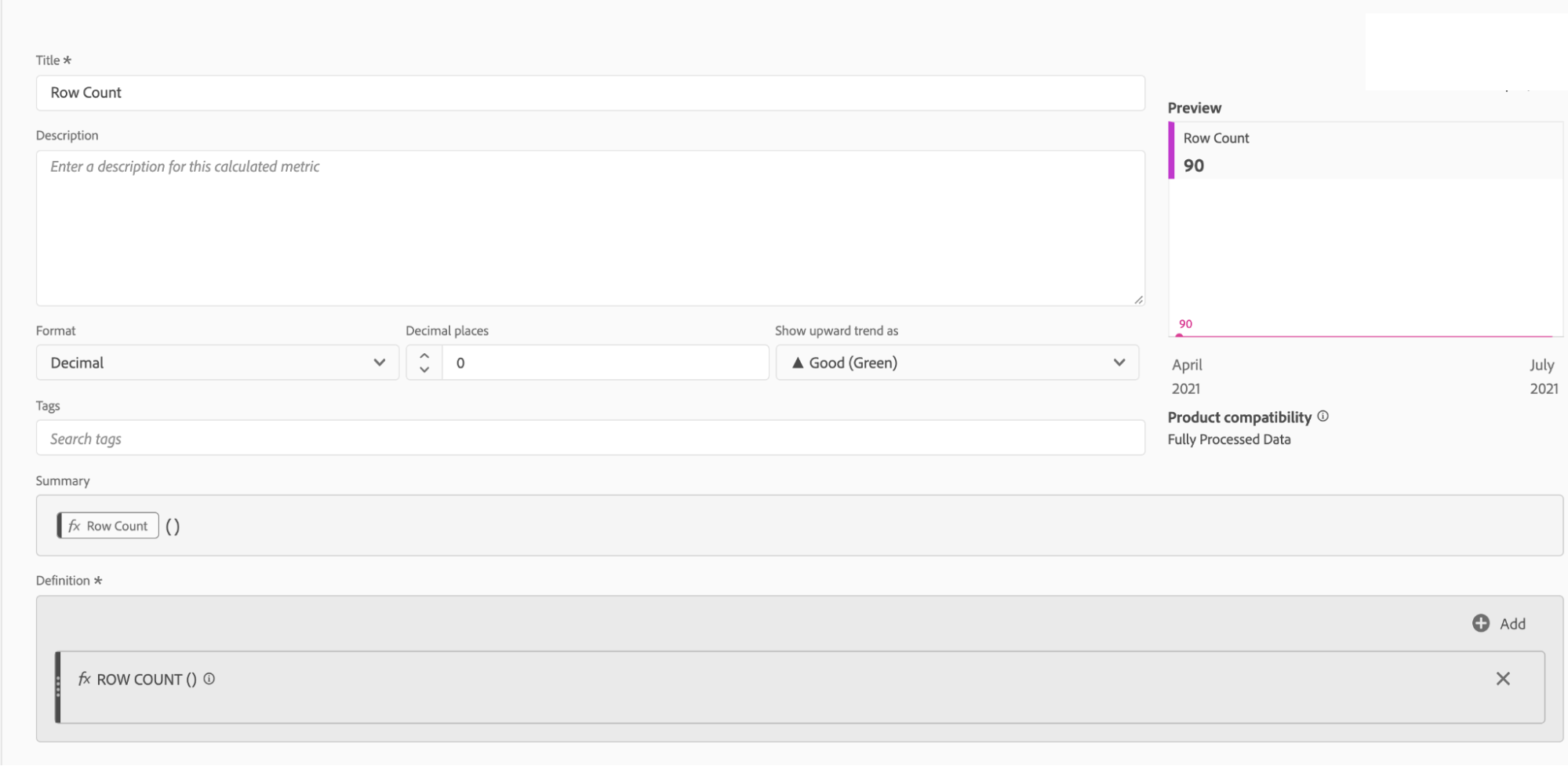
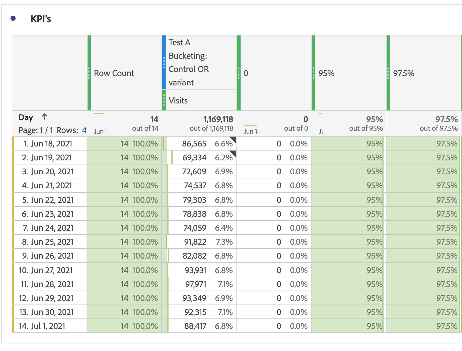
Next, let’s work on the four scorecards above the fallout report. Drag the “day” dimension to a freeform table and make a calculated metric that is simply “row count.” This will be your “Days live” counter:
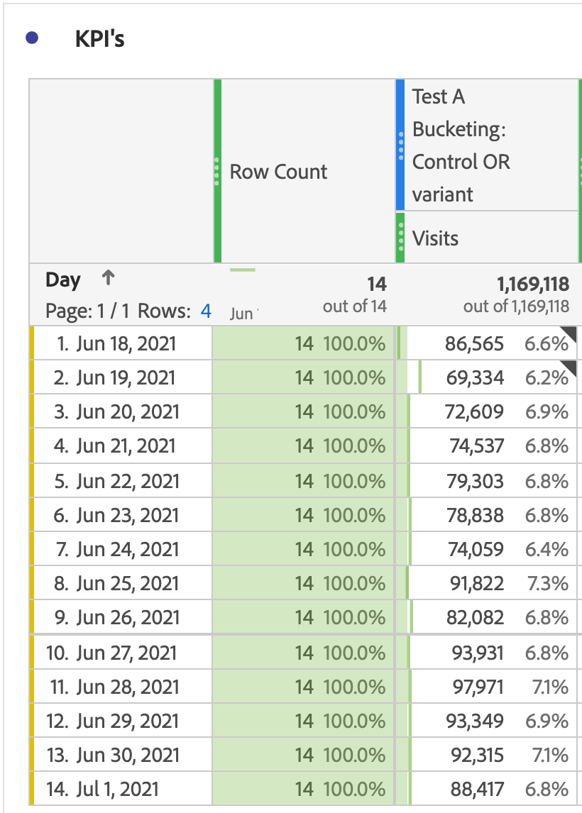
Next, make a simple segment that encompasses all visits that are grouped into either the control or the variant of the test, and drag that to your table with “visits” underneath it.
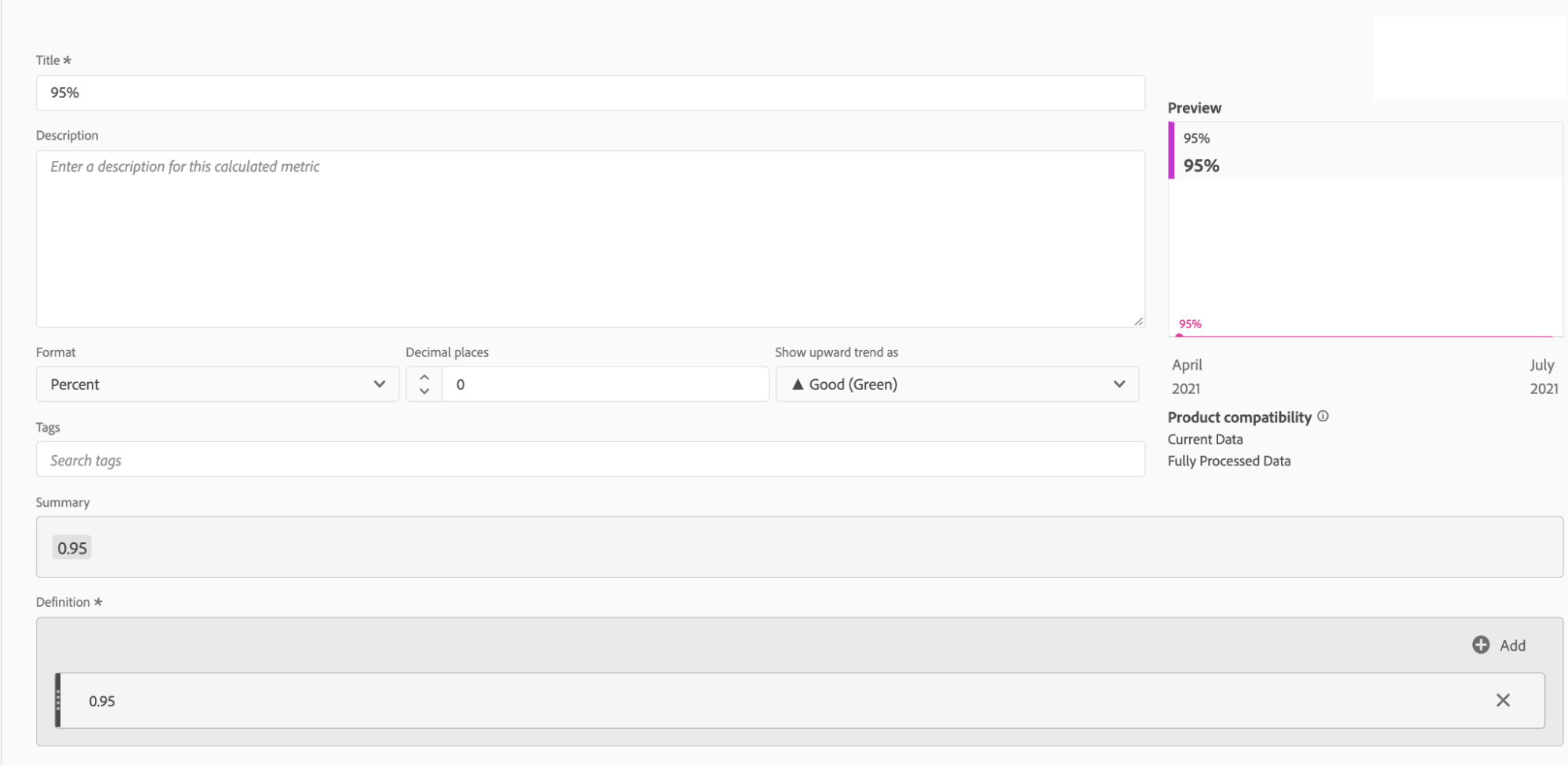
Now let’s add all of our reference numbers by creating three very simple calculated metrics. Each of them is just a static number: 0, 0.95, and 0.975.
By now your freeform table should look like this:
Calculations: Level 2 – Medium
Now we’re going to work on the first of our more complicated calculated metrics.
To make all of these calculated metrics, my building blocks are always segments with the visits metric in them. So when I’m calculating CVR, I build it like this:
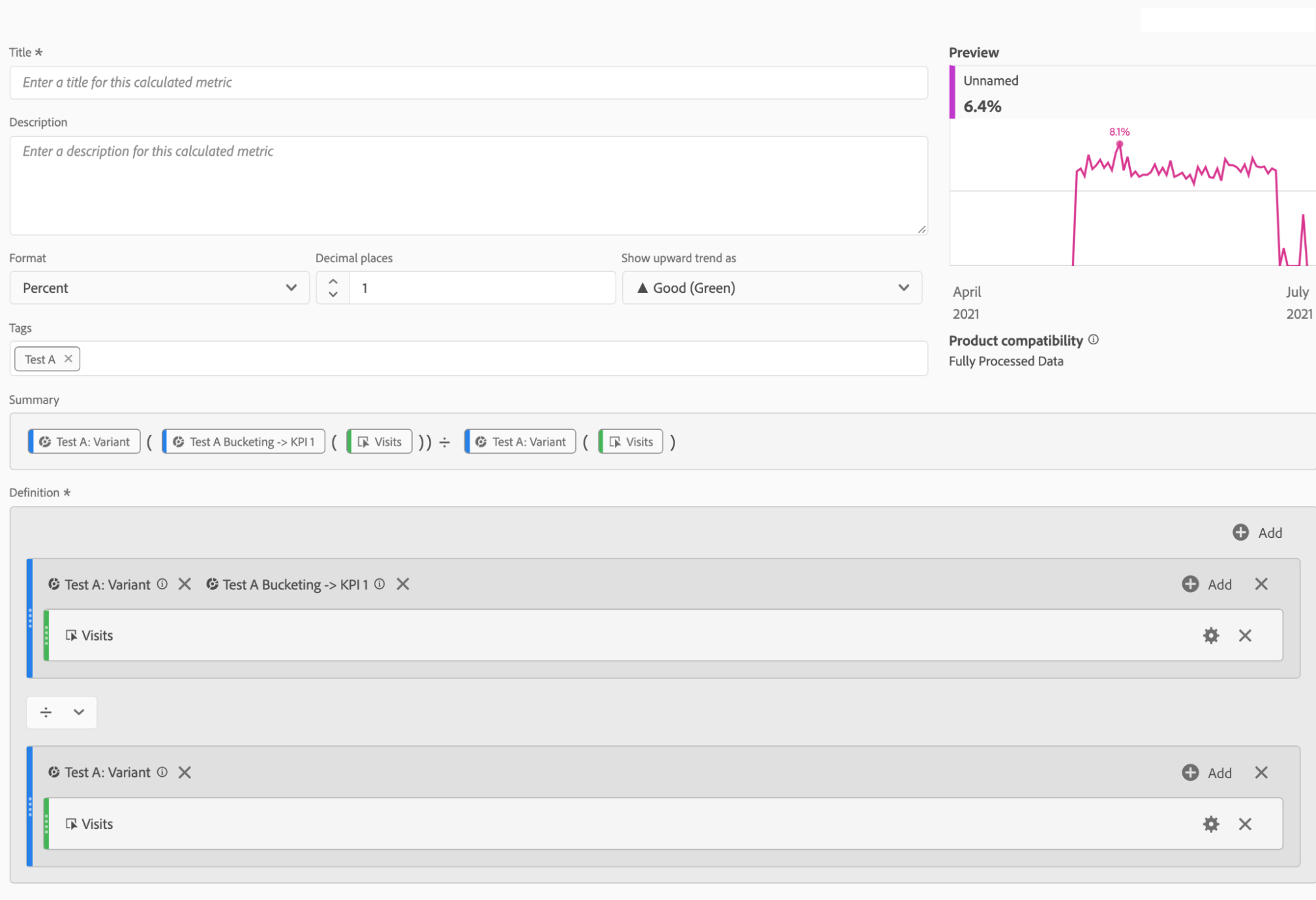
Where the Test A Bucketing -> KPI #1 segment looks like this:
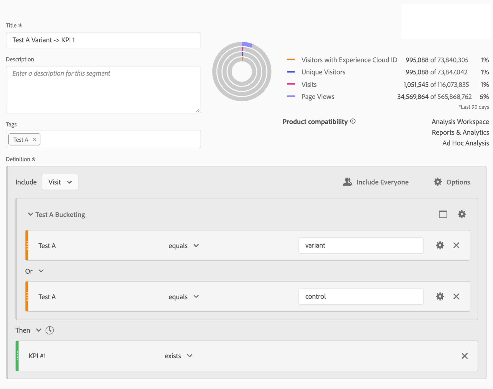
![]() Pro Tip: Use tags when creating these metrics and segments. That way, when you search in the components, you can easily find all of the metrics and segments related to your test.
Pro Tip: Use tags when creating these metrics and segments. That way, when you search in the components, you can easily find all of the metrics and segments related to your test.
So with that out of the way, the first metric we’ll make is CVR uplift. The underlying calculation for this is quite simple:
(CVR of Variant – CVR of Control)/CVR of Control
But if we simply do this as our metric, we get a pretty erratic chart:
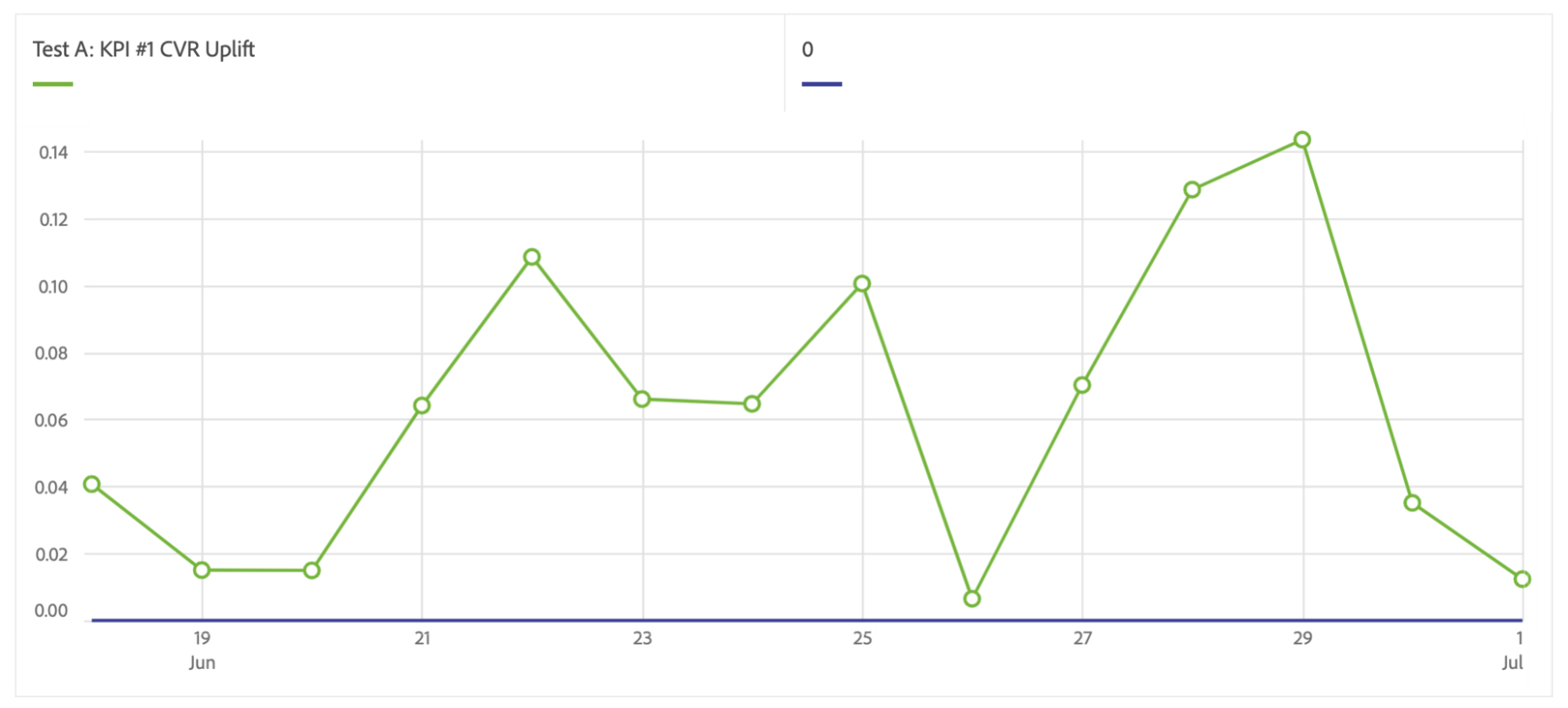
This chart shows us what the CVR uplift is for that day, but in reality, that’s not quite what I’m interested in. What I really want to see is: What’s the cumulative uplift for this test as each day goes by? So rather than knowing that on June 25, the CVR uplift was about 10%, I want to know how much the CVR uplift has been for all data up to that day between June 18 and June 25. To do this, we need to make use of the cumulative function in the workspace.
Calculated Metrics: Level 3 – Advanced
The equation of this is the same as we did before for overall CVR Uplift. The only difference is that we’ll add in the wrinkle of the cumulative function:
Before:
(CVR of Variant – CVR of Control)/CVR of Control
After:
(Cumulative CVR of Variant – Cumulative CVR of Control)/ Cumulative CVR of Control
Here’s how it looks in practice (click to enlarge):
The result of this will be a nice trended view of the uplift of this KPI:
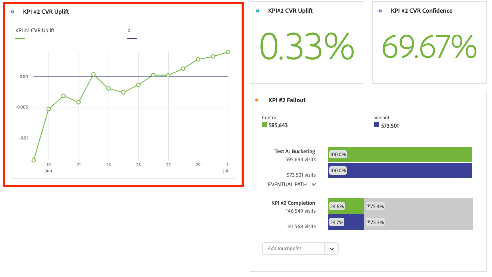
Finally, we’ve reached the most complicated of all these calculated metrics, and that’s our confidence level. If we simply build a calculated metric that shows us confidence, we’ll only be able to use that number in a scorecard, not a trended view. This is because, if we were to trend the metric, it’ll show us the confidence for the uplift of that particular day only. See an example of this below:
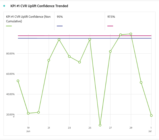
This chart is not particularly helpful. At this moment, this test has reached 100% confidence, but you wouldn’t know it from this chart. Just like with our Cumulative CVR Uplift metric, what we really want is a chart that’ll show us the cumulative confidence as the test continues to run.
This metric is quite complex with a lot of building blocks, but at its simplest form, it’s built as follows:
1 – T-Test (metric, degrees, tails)
Metric = Absolute Value ((Cumulative CVR of Variant – Cumulative CVR of Control) ÷ Sq Root (((Sq Root(Cumulative CVR of Variant x (1 – Cumulative CVR of Variant)))^2 / Cumulative Visits of Variant) + ((Sq Root (Cumulative Conversion Rate of Control x (1 – Cumulative CVR of Control)))^2 / Cumulative Visits of Control)))
Degrees = Cumulative Visits of Control + Cumulative Visits of Variant -2
Tails = 2
Here’s how that looks in the actual calculated metric builder (click to enlarge):
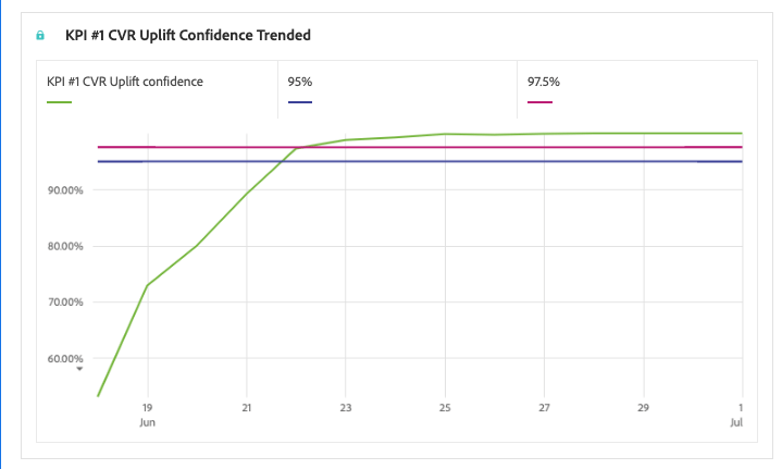
The result is a much easier-to-read at-a-glance trend line that’ll clearly show you when your test has reached significance and, if it hasn’t, what direction it’s trending cumulatively.
Round out your Adobe’s Analysis Workspace dashboard with some scorecard visualizations and a Fallout report and you’ve completed your A/B testing dashboard.
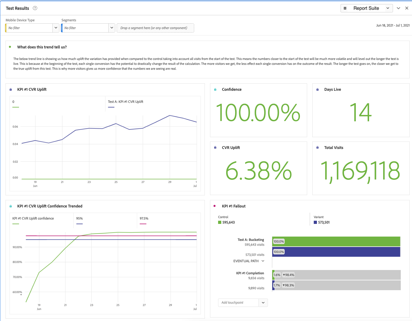
This is your first block. Once you’ve created this, it’s extremely simple to duplicate these calculated metrics and replace them with new KPIs to expand your A/B testing dashboard to see the results of more than one KPI:
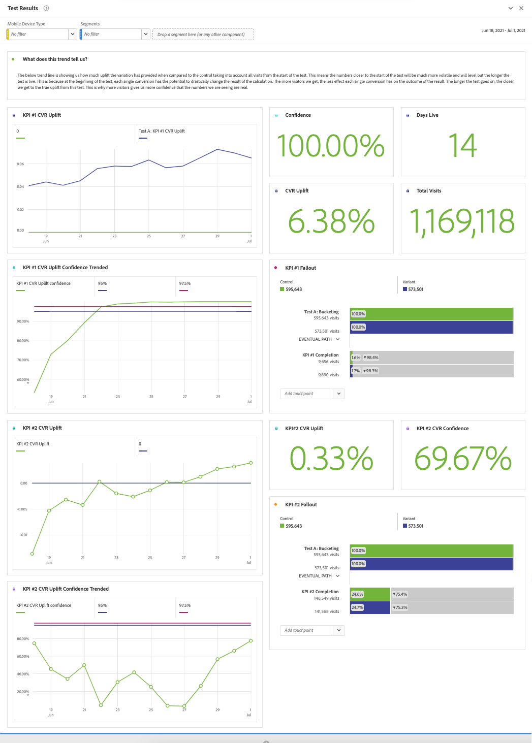
“Rinse and repeat” for each new test you run.
Practice Makes Perfect
To recap, the steps are:
- Make your simple calculated metrics:
- Row count for “days live” number
- Static numbers such as 0, 90%, 95%, and 97.5%
- Make your bucketing segments
- Make your converting segments
- Use the two above segments to create your cumulative uplift calculations using the cumulative function
- Use those segments to create a cumulative statistical significance calculation using the cumulative function.
- Add these metrics to a freeform table and build your visualizations.
- Repeat for secondary KPI’s
This process can take some time to totally nail down, but once you’ve done it a few times, it’s something you can set up very quickly.
Next-Level Customizations
The best part about Adobe Analysis Workspace is not just the power you have to create these complex metrics and visualize them in dashboards, but the level of freedom you have to perform analysis on the fly with all of your Adobe Analytics variables. As such, it would be a shame to just build these dashboards and leave them there. Here are three simple ways to take this dashboard to an even higher level:
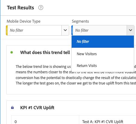
- Add segments to the dashboard to view your KPI uplift and confidence numbers by important visitor groups such as device type or New/Return visits:
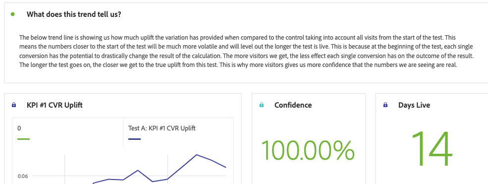
- Use text boxes or descriptions to help your less experienced stakeholders understand how to read interpret the numbers they’re seeing:
- As your stakeholders (or as you yourself) digest the Adobe Analysis Workspace dashboard and ask questions for further analysis, add new panels down below to answer those questions using visualizations and descriptions, as well as provide recommendations for future tests based on your analysis:
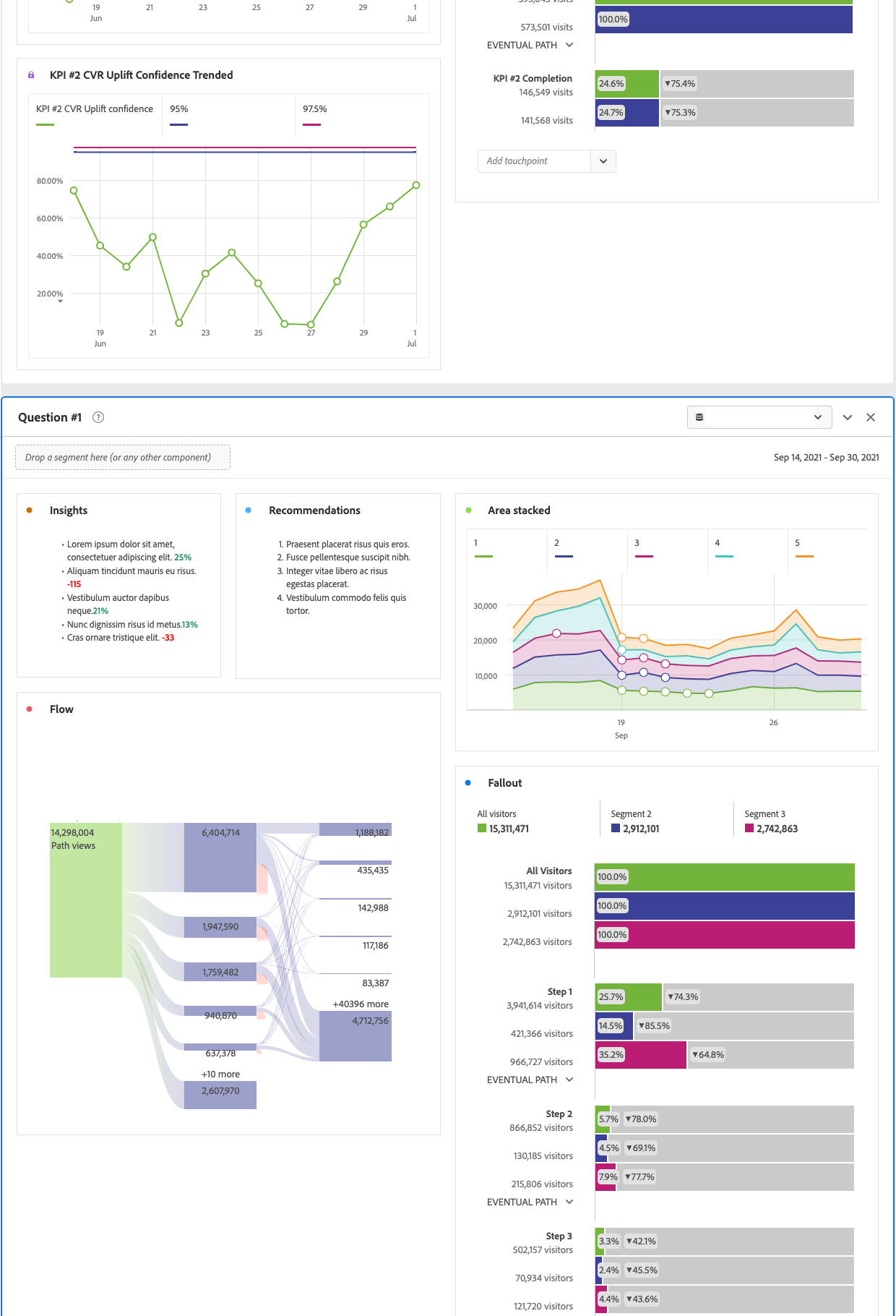
Add as many questions as you’d like!
![]() Pro Tip: Minimize them so your users can view them only if they’d like (and to help the dashboard load quicker).
Pro Tip: Minimize them so your users can view them only if they’d like (and to help the dashboard load quicker).
Adobe Analysis Workspace as a One-Stop-Shop
Once you’ve done all of this, you’ve turned Adobe Analysis Workspace into a one-stop shop for all things related to your A/B testing program. Stakeholders now have a place where they can monitor the progress of their tests, ask questions, get answers, and identify actions to be taken in future tests. This is a simple, repeatable formula that makes use of the best features of Adobe Analysis Workspace. And the best part is that this can be done with any testing platform — or, as my colleague Jer Tippets illustrated, no testing platform at all.
Want dashboards like this for your testing program? Let me know, and I’d be happy to help! (click to enlarge)


