Analytics Blog
Tableau Conference 2016: Top 10 Future Features
You say you’re not from Texas
Man as if I couldn’t tell
You think you pull your boots on right
And wear your hat so well
So pardon me my laughter
‘Cause I sure do understand
Even Moses got excited
When he saw the promised land
That’s right you’re not from Texas
That’s right you’re not from Texas
That’s right you’re not from Texas
But Texas wants you anyway
“That’s Right” – Lyle Lovett
What does the above have to do with Tableau, you ask? Well, I just got back from the 2016 Tableau Conference in Austin, Texas. The only state I’ve been in where there’s a store called “Guns and Gold.” Seriously, and it’s not a clever marketing ploy. The store sells guns…and gold.
And just as everything is bigger in Texas, so was this year’s Tableau Conference, with over 13,000 people attending.
The reveals for what Tableau has up its sleeves for future releases was also big. The timing of the various features isn’t clear, as some are part of Tableau’s three-year roadmap, but I’m going to share my top 10 features.
It’s hard to whittle the list down to 10, but here it goes….
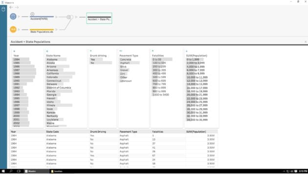
Feature #1: Maestro
 What is Maestro? Technically, it’s a distinguished musician, a conductor who leads the orchestra (or Lyle Lovett, who leads his Big Band). And so it makes sense that Tableau’s ETL tool would be named Maestro, as it will give you the ability to conduct, shape, and transform your data into something beautiful.
From the quick demo Tableau provided, you can:
- Perform data profiling. Allows you to visually inspect your data, seeing how many unique values you have for each column (visually with bar charts), and inspect what those values are by clicking on a column, allowing you to quickly see data issues that need to be resolved.
- Transform the incoming data. For example, suppose you have a year field, but it only some rows show the full year and others only the last two digits of the year (e.g. 16, 17, 18, 2015, 2020, etc.). You can highlight the two digit years and tell Maestro that it should be 2000 plus the two digits, and it will create a rule which will apply to all the rows highlighted and update the data.
- Create new fields. Provide the calculation or value for a new field, and Maestro will create it.
- Enhance data by pulling in data from Lookup tables. For example, if you’re source data has Zip Code, you can pull in Postal data from the US Post Office, and enhance the data by linking the Zip Code to get City, County, State, etc. for each Zip Code.
- Publish the results to Tableau Server for others to use.
Why should you care? For those who have limited IT tools or limited IT resources, now you can do some of the heavy lifting to prepare your data for analysis, augmenting and enhancing as you need!
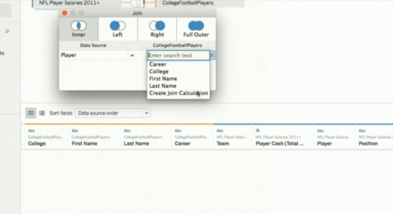
Feature #2: Join on Calculation
 I love the new cross database join functionality made available in Tableau 10! And now they addressed another issue which I have long desired, the ability to create a calculated field to join tables. This solves the problem of having data that can be joined but doesn’t have the exact matching data in both sources.
For example, in one data set all the states are in capitals (e.g. CA, TX, OR), but in another you have the state but in lower case. You can now create a calculated field which will transform the lowercase state to upper case (using the UPPER() function in Tableau) and now you can join the two tables.
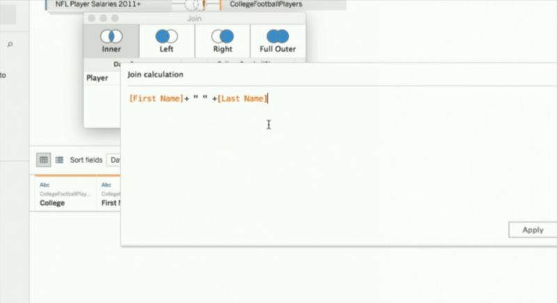
Select Create Join Calculation from the drop down list of possible fields to join with:
Create your calculation, which will then be used in the join!
Another example would be mismatched data types, such as one table having a string and another an integer.
Solution: create a calculated field changing the integer field to a string and joining on the calculated field. Both of the examples are very simple examples, but the functionality of joining on calculated fields will enable many possible solutions to joining your data which couldn’t be performed before. I love it!
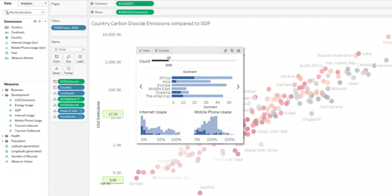
Feature #3: Hyper Database
 Seeing a trend in my top 10? I’m definitely biased towards the data end of functionality. Things that allow me to get my data, manipulate the data, transform and augment it, are key for what I’m ultimately going to present.
Without good clean data, your dashboards and data visualizations aren’t worth the paper they’re printed on.
And being able to access and visualize the data quickly makes my customer happy, which is very important.
So, Tableau bought a database company which uses new technology allowing billions of records to be processed and utilized at incredible speeds.
In one example, they showed a process which loaded approximately 22 million rows of data (data was from Project GDELT which has news events from around the world, containing about 400M records which appeared to have over 20 dimensions and about 10+ measures) in about a minute. While at the same time running a visualization against the data being loaded, which, when refreshed showed the records loaded thus far (about 12 million), and allowed filtering, adding of new fields, and etc. almost instantaneously.
Still not impressed? This next generation of relational database is intended for:
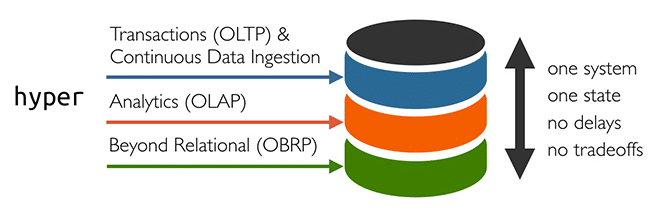
- One system — Data processing, data injection, and data warehousing. It is a one stop database which will be your transactional database, your data warehouse, and your reporting platform database, all in one. No need to create 3 databases and move and transform the data from one to the other.
- One state— it is real time, live access to data for whatever you are doing. Transactional, processing, reporting, all live, real time.
- No tradeoffs
- No delays
My only question is, when will it become available and be integrated with Tableau? They said sometime next year.
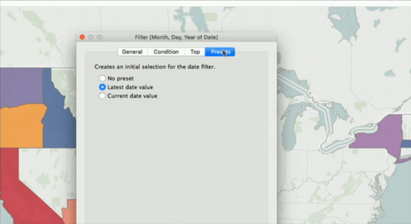
Feature #4: Most Recent Date Filter
 Yes, pick yourself up off the floor, it’s true. For date fields you will now have the option to set a filter so only the most recent date in the data is displayed.
No more complicated hacks and workarounds, it will be a tab in the filter called “presets” with a radio button to show the most recent date or current date. As new data is added, this filter will make sure that your users will only see the most recent date. Ahhhhhh.
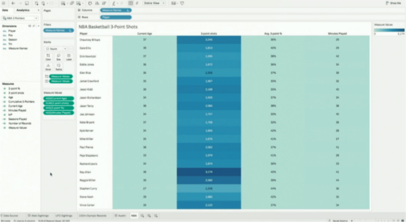
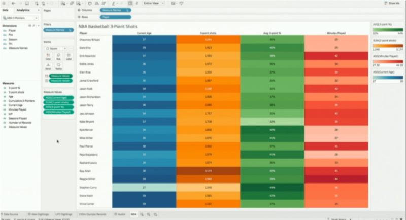
Feature #5: Legends per Measure
 No more moaning and groaning about how you can’t format one measure different from another. Now each measure can have it’s own legend, allowing you to format each measure differently.
So Sales can have have a color range different from the Percent of Profit color range, allowing you to easily highlight positive or negative performance for each measure individually. “Yippee ki-yay!” John McClane
Before:
After (each measure with it’s own color legend and range):
Feature #6: Viz within Tooltip
 Tableau has shared this before, but it hasn’t been made available to date. However, they did add a twist.
Not only will the tooltips allow you to show a visualization inside it, but you can also interact with that visualization and use it to modify the parent viz. By selecting a field within the tooltip, you can highlight within the parent viz, allowing you to gain additional insights. Saaaa-weeeeet!
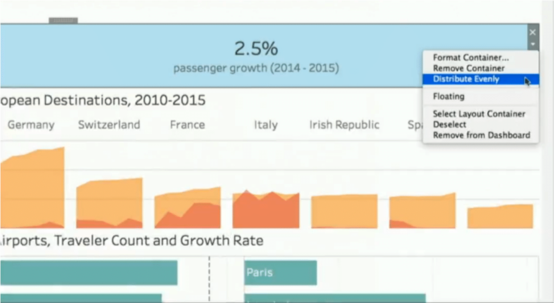
Feature #7: Distribute Evenly within Container
 Ever struggle with having three or four items in a container and you want to distribute them evenly across your dashboard?
You would drag the edges to try to make each one the same width, or float the items and figure out the exact XY coordinates and how wide each item needed to be, only to have a new data element added later which messed up your distribution.
Tableau is adding “distribute evenly” within a container so you don’t have to do it yourself anymore. One click of a button and it’s done. They also are adding the ability to add margins, borders, and left/right/upper/lower padding.
Before:
New Functionality (Select Distribute Evenly):
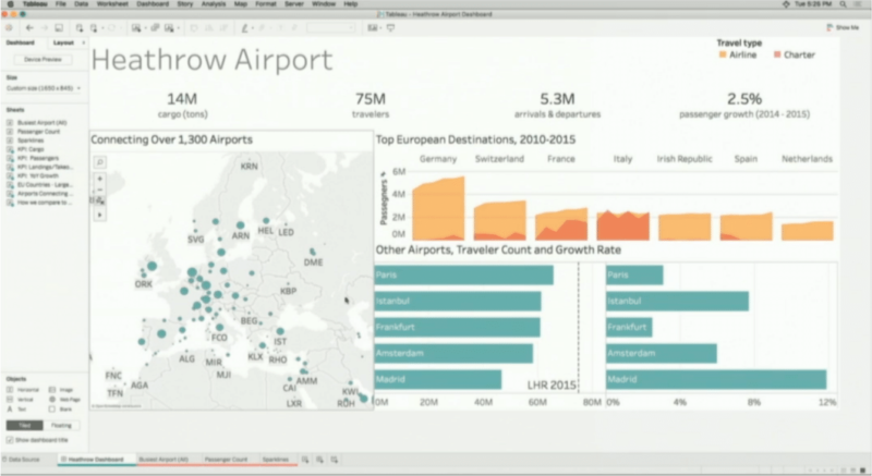
After:
Feature #8: Expressive Text Editor
 You will be able to add images, hyperlinks, bulleted lists, columnar layout, and horizontal rules with Tableau’s new expressive text editor. It works for titles, captions, tooltips, text fields, anyplace you would add text. (Smiley Face, Thumbs Up, Strong Emoji’s)
Feature #9: PDF Data Connector
Data.gov has tons of useful data on it…but lots of it is in PDF files. And, if you have ever tried to work with extracting data from a PDF file, be it with brute force of copy/paste, it isn’t fun.
Enter Tableau’s PDF Data Connector which allows you to connect to PDF files which will identify tables and create data sources from them, as well as allowing you to change the data type of the resulting fields!
As an example, they showed a PDF file that had 16 pages. The data connector identified the table and created a data source for each page. Assuming all pages contained the same data, you could then use the Union functionality to unify the data into one source, which you will then use for your visualizations.
They also will be adding Union functionality for database tables, for those of you who aren’t comfortable writing your own Union statements in SQL. And, for some cloud content, like Marketo, they will provide pre-built connections so that if you don’t know the Marketo data schema (what tables exist, the keys to join them on, etc.), there will be pre-built sources you can select and utilize for accessing your Marketo data.
Feature #10: Python Integration
 I would be remiss, and my co-worker João would be offended, if I didn’t mention that Tableau will allow you to integrate with Python. Though I didn’t get to attend the developer presentation on this particular feature, and the details in the keynote were sparse, it would work similar to how Tableau integrates with R, allowing data to be passed to Python, transformed by the Python package called, and results returned to Tableau which can then be used for your visualizations.
Bonus Feature #11: Natural Language Support
I told you it was hard to keep the list to the top 10 coming new features in Tableau.
This one could be quite significant, but I imagine it will take some time to fully reach the functionality one would want. Imagine seeing a housing data visualization. You type (or I assume at some point if your PC has the ability to convert voice to text you can just speak), “show me houses in Seattle that are over $600k.”
The visualization returns what you asked. You then further refine your question by asking, “which ones are in South Lake Union?” The query remembers your previous question and modifies the results as you would with a continued conversation with a friend.
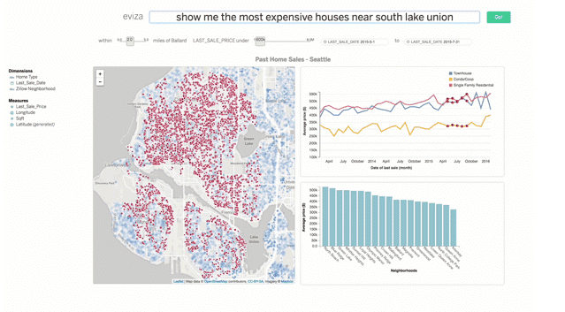
They have added functionality to understand $600K and 600,000 or questions such as “show me the most expensive houses” with Tableau interpreting what measure to use and providing a method for adjusting “most expensive” by providing a sliding filter to allow you to adjust the cost based on your needs. You can ask for a measure not seen and it can use it as a filter.
As I said, this can be groundbreaking, but I imagine it will take some time to reach its potential.
That’s it, Lyle Lovett or Leave it
So there you have it, my top 10 (err, 11) future features from Tableau, straight from Austin, Texas. There are more, and just because I didn’t list them doesn’t mean they aren’t valuable and powerful. I had to draw the line somewhere.
And if I may, let me leave you with one last last piece of advice from my good friend Lyle Lovett. Ok, he’s not my friend, but I like to think if he knew me, we’d be friends. I’d help him co-write a song about Tableau:
“If I had a data connector
I’d go and get some data,
And if I had some data
I’d create an awesome viz
And in my awesome viz
You’d gain some real deep insights
Like how much you mean to me
And how much I love you.”
– Nick Mannon
(To the tune of “If I Had A Boat”)
(Note: the blog comment section is meant to comment about the blog contents, not my woeful lyric writing capabilities…unless you’re Lyle Lovett and you want to use this for your next song.)


If you have questions or you’re ready to discuss how Blast can help you EVOLVE your organization, talk to an Analytics Consultant today.
Call 1 (888) 252-7866 or contact us below.